A Little Analysis of Team GB's London 2012 Medals
Intrigued After the Blur of the Olympics
The recent Olympics were all a bit of a blur, and so the other day I found myself wondering - which were Team GB's most successful days? How many athletes were involved in sports that won the most medals? And what did Team GB actually end up winning anyway (in terms of golds, silvers and bronze)?
Data
I took a date-ordered list of Team GB medals from Wikipedia, and started fiddling with it.
I'd have preferred to have used data from the Guardians 2012 data blog (their data follows the "official" IOC classifications) but as far as I could tell none of their data included dates. Which was a little sad.
Pie Chart of Sports
First up, a simple pie chart listing which sports won which medals. It's not really a surprise that cycling, rowing and athletics dominated (rollover the percentages to identify the sport):
Bubble Chart of Sports
Next, a slightly different take on the medals won by each sport, this time using a bubble chart. So, the Y axis lists the no. of medals won, the X axis the percentage of all medals won by a particular sport, and the size of each bubble representing the number of atheletes involved in winning those medals (rollover each bubble to find out information specific to each sport):
We can clearly see that the sports that involved the most athletes were cycling, rowing and down the bottom left - hockey. It's kind of interesting seeing such people-heavy sports winning so many medals.
I wonder if the "elite sports" focus that was apparently used in deciding which sports received the most funding narrowed in on the most-likely-to-win-medals criteria more than straight value-for-money (given that those with biggest teams and requiring significant specialist equipment would be the more expensive). Be interesting to know some of the criteria, and whether they are under pressure to focus more on value-for-money.
Interactive Animation of Growth of Team GB Medals (By Colour)
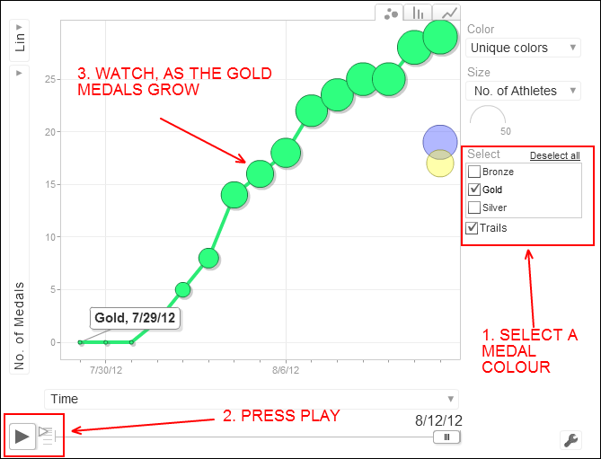
Next up, a little day-by-day animation of how the Team GB medals were won, counting the total number of the different colours of medals as they increase day-by-day.
First though, a little explanation of how it works (clearly it'd be better if it didn't need the explanation, but it seems to):

Feel free, have a go (don't forget to click the play arrow, or just drag the slider along yourself):
If you plot just the Gold medals, the biggest jump is from Aug 3rd to Aug 4th, when Team GB won six golds. Amazing.
Team GB Medals, Grouped by Sport
And finally, another interactive animation showing the growth in medals for each sport.
Don't forget, the height of a bubble indicates the number of medals, the size indicates the number of atheletes involved in winning those medals.
Where would Team GB have been without cycling and rowing eh?
